Background
Imagine trying to get your 1.56 million employees back into the office. Andy Jassy, CEO of Amazon Inc., has pushed for a full return to in-person work after noticing advantages in a phased transition. While you might not be Andy Jassy, you surely can imagine the logistics this involves. It takes the form of the all-dreaded commute.
The Challenge
Commuting is an Overhead Cost
Amazon noticed its employees driving to work through the same congested areas along similar routes. At first glance, the traditional commute had pointed to various problems:
- Creating traffic bottlenecks at certain locations
- Contributing to air pollution
- Forcing employees to find parking
But these issues were second to one that was hard to miss — driving proved to be mentally draining. The morning peak of mental alertness was wasted by employees in getting to the office. Productivity levels suffered when employees had already spent much of their focus on low ROI activities.
Kick-Off
Heroes of our Story
Three innovative software developers based out of the Ireland HQ had brainstormed a solution to Amazon’s woes:
- Frances Humphreys — Software Development Manager
- Flavia Gheorghe — Sr. Software Development Engineer
- Paula Căciulescu — Software Development Engineer
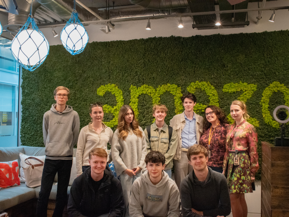
With a vision in mind, the trio reached out to the SwEng Industry Projects program at my university — Trinity College Dublin. The initiative connects future engineers with companies to work together on real-life industry projects. These are proposed & mentored by select partners like Amazon. Having seen their project proposal, I was one of eight others to share their vision and act on it over the course of 12 weeks.
A Vision & Objective Worth Sharing
So, what was their vision?
Frances, Flavia and Paula (our partnered clients) saw potential in a cross-platform mobile application enabling a carpooling-to-work initiative. Amazon employees would thus be able to search for and offer rides to the office together with other employees at the firm.
The objective of this project encompassed the client being able to organize carpools with little effort through the app. In direct response to the identified problems, the project would:
- Greatly reduce the cost of commuting
- Help employees be more productive at work
- Boost morale in a social environment outside of work
Defining the Scope
Rooting for Clarity
The team was assembled. The vision and objective were settled. But, what now? We had one big gap separating us from knowing what features to build or leave out. The team was missing concrete product requirements.
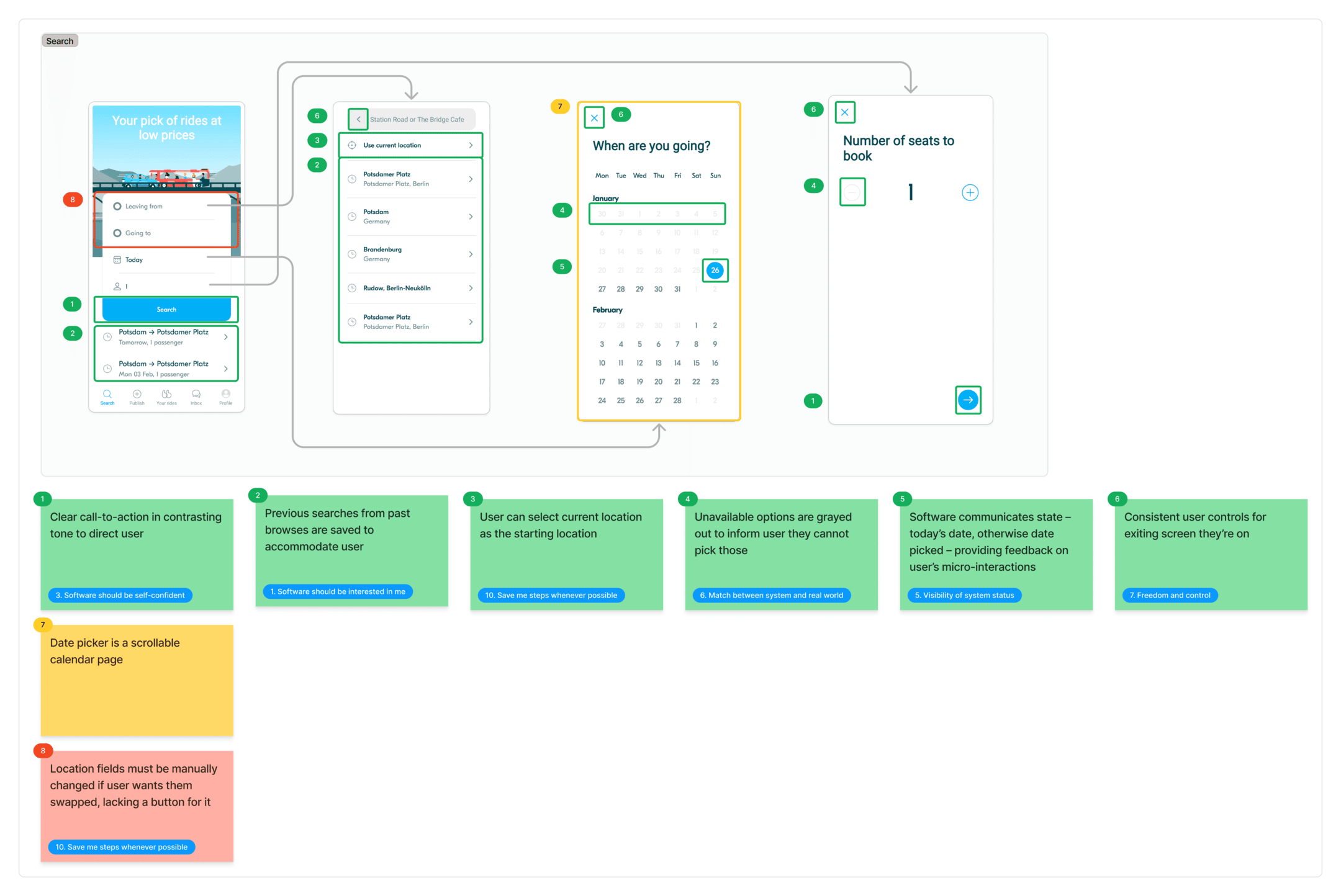
Enter the Competitive Benchmark. Our first team meeting had me curious for initial impressions of how other carpooling services were approaching their software design. A weekend’s worth of work had me investigating two crucial aspects — the ride searching and ride posting features of comparable mobile apps.
The Discovery
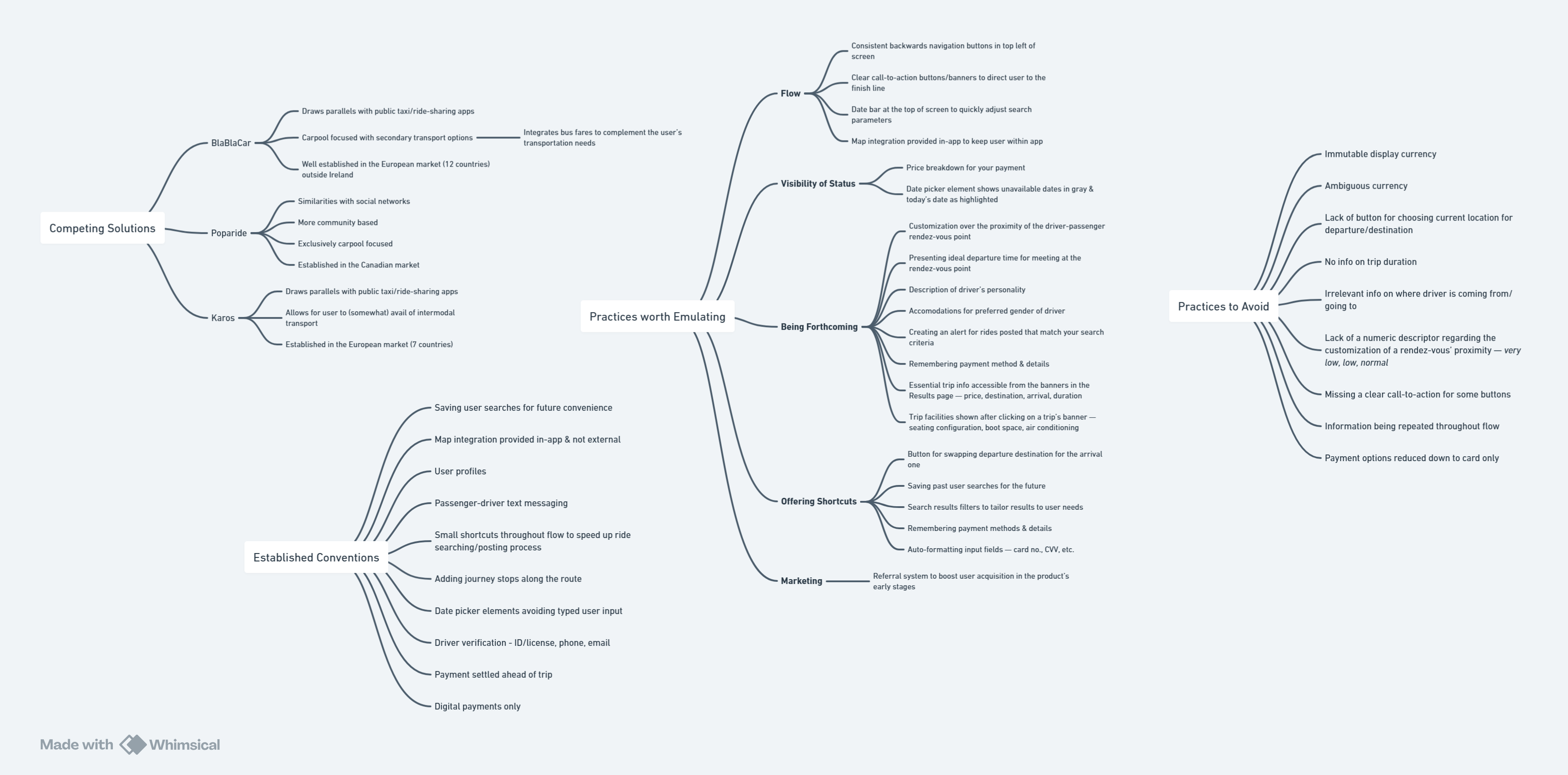
The level of qualitative insights we got answered many unknowns:
- How do competitors solve the problem?
- What established design & feature conventions must we copy?
- What practices should we emulate?
- What practices should we avoid?
Setting Product Requirements
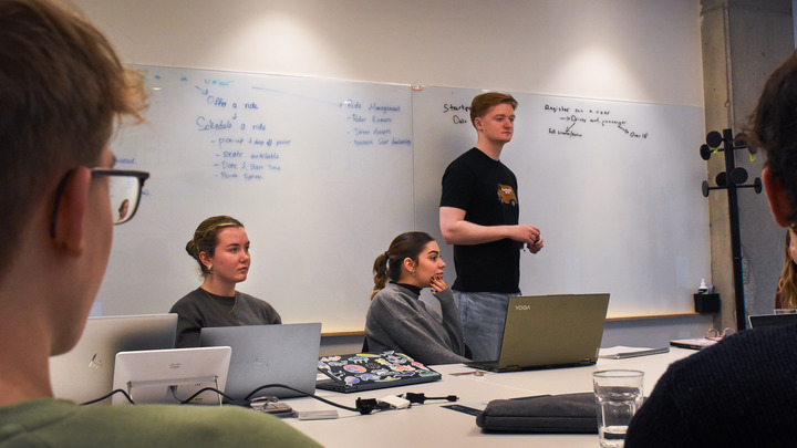
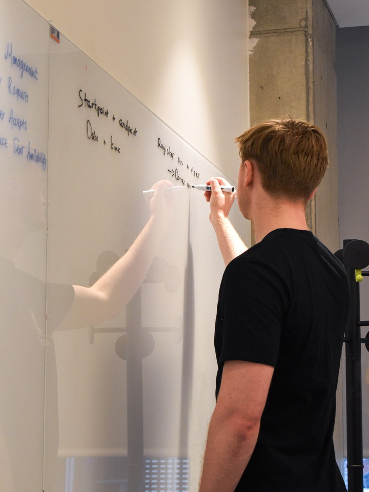
In no time I got the team brainstorming on wider spans. After a quick debrief on the Competitive Benchmark, the team & clients were ready to sit down and collectively agree on the product requirements.
All Hands on Deck
Thinking of the Users
You need time for people to agree on something. We were already into Week 3 (out of 12) by the time the product requirements list was given the stamp of approval. And we had just 8 days to put together something tangible for our 1st Sprint Review.
Now, I tend to follow the UX process quite religiously. I’m a big believer in good research generating great products. For this reason, I wanted to push for more data — by conducting usability tests on carpooling apps I benchmarked. Did these apps match the mental models of users?
I had little time to answer that question. The team leader wanted me to move from research into design mode.
So I asked myself — “why not use the apps I benchmarked to influence our design decisions?” Given their longstanding availability and considerable user base, I hypothesized that they already underwent extensive user trials & feedback. Their information architecture (IA) must hence match the user’s mental models with a high level of confidence.
Creating the Scaffolding
There was one question on everyone’s minds: “How do we structure the app? Where do we even begin?” Inspired by the apps we benchmarked, I began mapping our own IA.
A User Flow diagram was the solution. At a high level, it proved practical in laying out various interactions & screen states. From the moment the user created an account, down to their ride confirmation. The combination would dictate what the user encounters & when during their navigation.
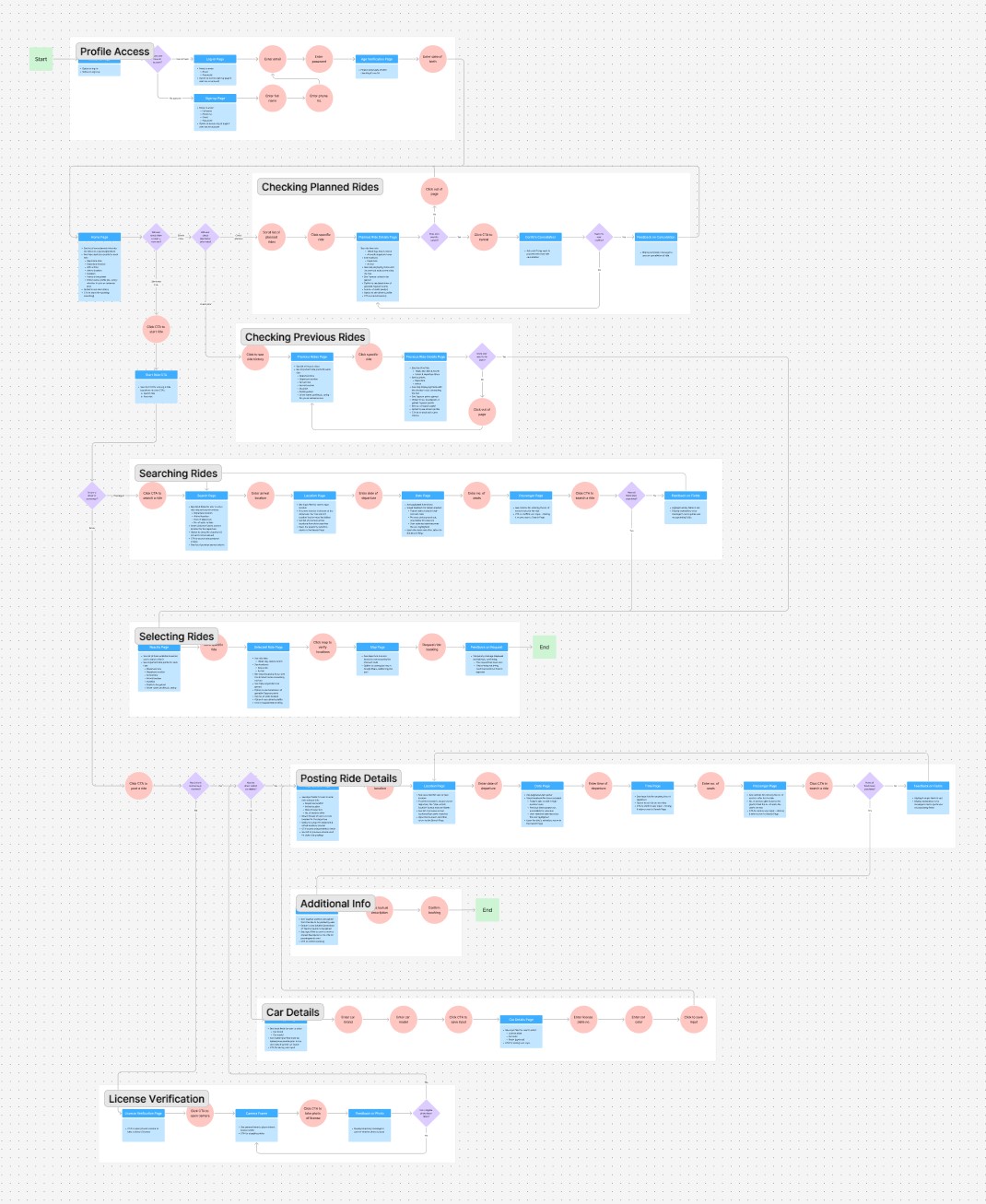
At a lower level, however, I wanted to break down the most common problem in stages. What was the user’s goal at each stage of our app? That’s why I split the app navigation into “sub-flows”.

By Week 4, a completed user flow had constructed the IA — bringing us closer to the first interface designs of our app.
Iterating App Designs
Sketching was the way to go for rapid ideation over app designs. I often partnered with our frontend developer to incorporate frequent feedback into drafted designs for screens. It helped us avoid components debated as “too difficult” to implement down the line.
Incremental changes were also less likely to be disputed. We achieved quick agreement over design ideas — proving the power of working in an Agile environment. I delivered the sketches and my partner developed the screens in React.js.
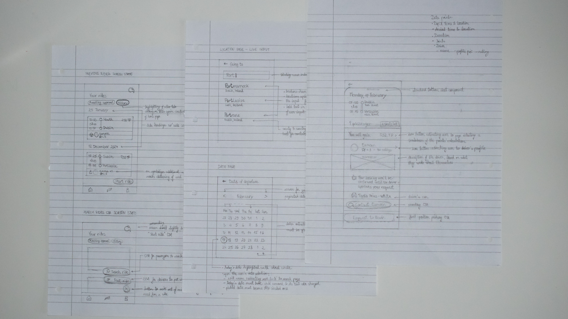
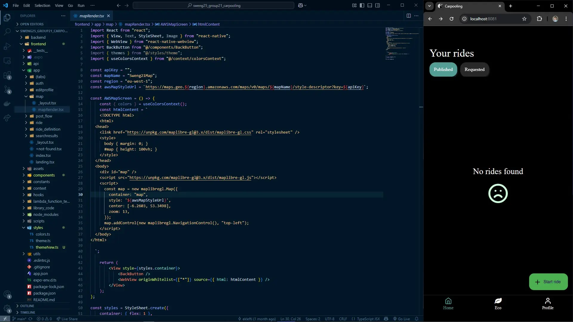
Our dynamic held strong from Week 5 until almost the end of the project. I also found myself coding too! To meet tight deadlines while building frontend intuition, I took over smaller tasks I knew I could deliver.
A Respectable Finish
Finalizing the Prototype
For many weeks we had a steady stream of code pushing the native prototype to completion. It was by Week 10 when things started getting heated…
Our app worked. It was functional. It met a lot of criteria on the product requirements list. Except for one — “the users to find this experience as smooth as possible”. There was nothing smooth about the inconsistency of our UI design. As a consequence of rapid prototyping, we favoured functionality over user perception.
It was for THE COMMUTERS that we were building this app. We couldn’t deliver a confusing-looking product that would add to their mental exhaustion. The team would be solving one less problem motivating this project.
Adding Some Flair
I took it upon myself to deliver a well-rounded interface with just 2 weeks to go. It was time to leverage a design system.
I drew substantial inspiration from Google’s Material Design 3. Put together by their powerhouse of designers, I was in safe hands by covering 80% of Tapacar’s use cases with their readily-designed UI components. Of the tweaks I made were app-specific redesigns to components & adaptations to color tokens to match Tapacar’s branding.
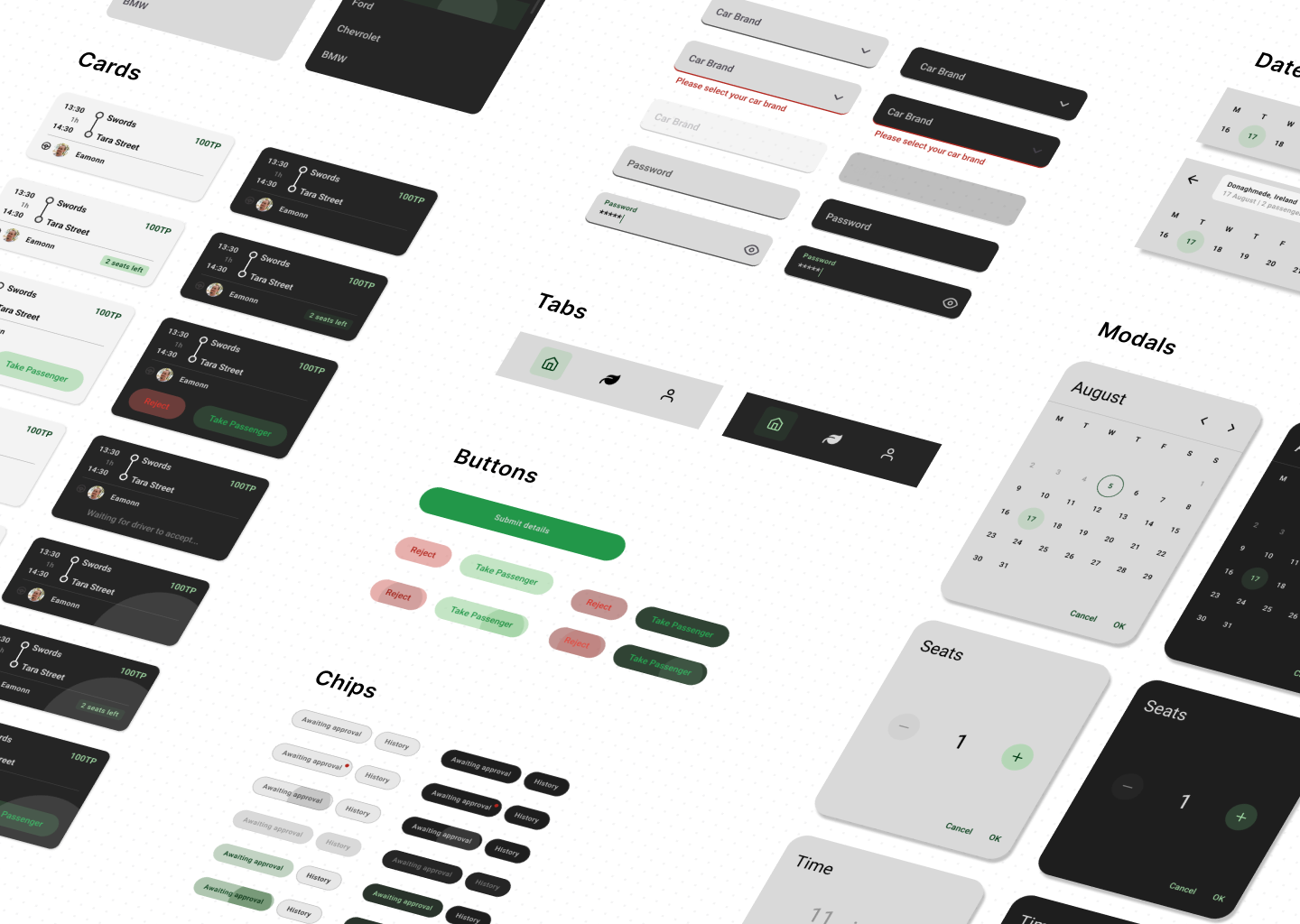
Had I designed a UI from scratch, the app would’ve never materialized its visual potential. It takes too much time to figure out spacing, typography, colors in a unified context by yourself.
The Solution
Wow, are you still reading?! You must be hooked to see the final result. I have something that won’t disappoint…
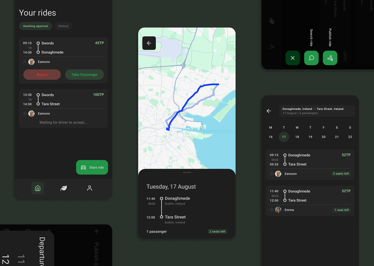
Talk about a carpooling app now! Presenting Tapacar — the next generation of mobility to the office. Our MVP has the required capabilities you need to enjoy a pleasant commute:
SEARCH A RIDE
Passengers (i.e. employees in need of a lift) are able to search a ride by logging their destination and the date & time to leave at. They also input the number of seats to book for that ride. Results of rides offered by drivers are then presented. The user picks one and requests the driver’s confirmation before the booking is settled.
PUBLISH A RIDE
Drivers (i.e. employees looking to provide lifts) can offer a ride by logging their departure point, destination and time they will leave at. They also input the number of seats available for that ride. These parameters are used to publish their availability for offering a ride to others. This ride will be presented to any passengers searching for rides with similar parameters.
PASSENGER-DRIVER INTERACTIONS
Drivers have a say over what passengers to pick up. Each passenger must wait for the driver’s confirmation before they avail of the ride.
ECO REPORT
Drivers & passengers have a summary page outlining their energy/pollution savings as a result of carpooling activity. It acts as a tangible method for users to understand their impact on the environment.
Resolution
Making an Impact
The whole project behind Tapacar was motivated by three problems related to traditional commutes. How well does our solution target them? Let’s take another look with a fresh perspective:
KEY PROBLEM
- Before: Employees arriving at the office mentally drained from a draining commute.
- After: Employees now improve morale in a social environment outside of work when they socialize with fellow employees on their commute.
SUB-PROBLEM #1
- Before: Creating traffic bottlenecks at certain locations.
- After: Searching & publishing rides reduces cars on the roads & boosts vehicle occupancy rates.
SUB-PROBLEM #2
- Before: Contributing to air pollution.
- After: Eco reports incentivize commuters to avail of environmentally friendly methods of commuting, e.g. carpooling.
SUB-PROBLEM #3
- Before: Forcing employees to find parking.
- After: Employee car parks notice higher capacity in light of higher vehicle occupancy rates across the company.
With these checkboxes ticked, our clients were delighted to see a well-grounded project that was handed off on the right tone.
What's Next
Twelve weeks offered us the opportunity to bootstrap a respectable MVP. However, we cut a lot of corners to meet tight deadlines. For one, we were left with no time to test our shiny digital prototype with our target audience. Let alone code it natively after a successful testing run.
As such, a usability testing would be long due. User feedback would need to be incorporated before the app rolls out and receives additional features.
What I Learned
Any project will have its setbacks, chaos and unpredictability. It’s the nature of the game. And we de-risked it as much as possible by following Agile principles backed by frequent Scrum meetings.
I’ve picked up valuable lessons on staying agile in a tight timeframe. If you want to win at the game, you must plan & research before anyone else. A finished Competitive Benchmark, for instance, should’ve been presented at the first team meeting. That’s a week’s time gained right there. Think you can do something else in that period? Conduct a usability test on competitors’ apps and leverage more insights to drive the design of a better-tailored solution. That eliminates a lot of unknowns, especially if Tapacar were to actually hit the markets. I would not let a real life product go without a testing session.
What questions do you have for me?
I would love to know what you think! If you want more context to show you what I can do for your business, let's do it over an interview.